With the help of an extremely talented team of designer, web architect, community visionary and marketing gurus, I've introduced J-Net community members to a new mobile UI from Lithium. It's certainly very encouraging to see a large number of positive comments and praises from our community members. To me, the enthusiasm we saw really validated the media convergence movement to the "three screen and a cloud" vision. As a community manager, it is extremely satisfying to roll out a well received feature that truly helps our community members engage and collaborate more, with a "cool factor" to boot.
The advantages to having a mobile enabled community are fairly obvious, but the consequences of making the wrong mobile decision can have long term negative effects. After all, we have *one* opportunity to do it right when it comes to gaining time share on the second screen folks look at the most. A problematic deployment would have discouraged users from accessing our community via mobile device, and it will be difficult to gain trust and momentum with a second attempt. The new Lithium mobile platforms offers quite a few bells and whistles, but following are two primary reasons why I think Lithium's "got it" when it comes to community mobile UI:
1. Clearly, device agnostic solutions are the wave of the future. While we could have taken the app store route and developed a community app for the most popular mobile device, we would have ended up with a large number of disappointed users complaining about cross platform support. Developing an app for multiple mobile platforms and maintaining multiple versions of the app would've certainly been an unwise investment and a capital drain. Granted, mobile apps have their places in this world. However, there is already a powerful application that takes online discussion data from a community databases and render them according to device screen/capabilities: it's the mobile web browser. Lithium's device detection feature renders outputs according to device/browser sizes and capabilities, and it is a much more scalable solution compared to custom apps.
2. Simplicity and functionality. Lithium's UI designers have created a page layout that is light yet functional. There are no excessive images and codes to load, yet most key functions are available. With the mobile UI, we are allowing our community members to gain productivity with pockets of time previously wasted (waiting in line for coffee, train and bus rides...etc). It's not aimed at replacing or competing with PC screens (not with the current generation of smart phones anyway). Lithium's implementation has the right balance between functionality and simplicity. This elegant solution allows our community members to participate in forums and blogs, while saving some of the less frequently accessed features for the desktop UI.
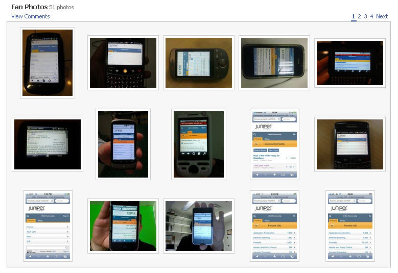
We are now on the 4th day after the mobile UI launch, so far everything seems to be working fairly smoothly. Is this mobile UI perfect? Of course not. As with all new technology implementations, there are always a few minor glitches. The key is that these minor issues do not degrade user experience, and I am confident they will be patched in future releases. We've ran a few contests soliciting user comments as well as screenshots/photos, and the response has been very enthusiastic. Although I sincerely appreciate all of the positive praises, my favorite user comment cuts to the chase, and it really gave me a good chuckle:

Ain't that the truth in today's hyper connected world ;-)
1 comment:
Great to see your updated blog! And it's really nice to read your article as always. You have covered everything about Mobile version website.
Thank you so much for listing me on this blog! Much appreciated.
Cheers
Post a Comment